A landing page can lose the sale in under five seconds. Not because your business lacks value, but because the page asks people to do too much work. If you’re trying to figure out how to improve landing conversions, start there: reduce friction, increase clarity, and make the next step feel obvious.
Too many businesses treat conversion problems like a traffic problem. They buy more clicks, launch more campaigns, and hope volume makes up for weak performance. It rarely does. A landing page that converts well is not just prettier, faster, or more polished. It is more aligned with buyer intent. It answers the visitor’s question quickly, proves credibility, and gives them a reason to act now instead of later.
How to improve landing conversions starts with message match
Most conversion issues begin before someone even lands on the page. If your ad, email, search snippet, or referral promise says one thing and the page delivers something broader, vaguer, or different, conversion drops fast. People do not want to decode your offer. They want confirmation that they are in the right place.
That means the headline should reflect the promise that got the click. If someone searched for a service that solves a specific problem, your landing page should lead with that problem and your solution to it. Not your company history. Not a generic value statement. Not a slideshow full of abstract branding language.
Good message match creates momentum. It tells the visitor, yes, this is exactly what you were looking for. That momentum matters because every second of uncertainty gives people another reason to leave.
Lead with a headline that says something real
A weak headline usually sounds polished but empty. Phrases like “grow your business” or “solutions for modern brands” do not help people make decisions. Strong headlines are specific. They identify the audience, the pain point, the outcome, or all three.
The trade-off is that specific messaging can feel narrower. That is usually a good thing. Broad pages often attract more unqualified interest and convert worse. Narrower pages speak directly to the right people and perform better with serious buyers.
Remove friction before you add persuasion
Businesses often jump straight to persuasion tactics – testimonials, urgency, design polish, button color tests – before fixing basic usability issues. But friction kills conversions faster than weak persuasion.
If the form is too long, people hesitate. If the page loads slowly, they leave. If the call to action is buried halfway down the page, many never see it. If mobile spacing is cramped or the button is hard to tap, intent drops off. None of that is dramatic, but all of it is expensive.
The strongest landing pages feel easy. There is no confusion about what the offer is, what happens next, or how much effort is required. That ease creates trust.
Cut the form to what you actually need
Every extra field has a cost. Sometimes that cost is worth paying if you need better lead qualification. Sometimes it is not. A high-intent enterprise lead form may justify more detail. A top-of-funnel consultation offer usually benefits from asking less.
If you’re unsure, start with the minimum information needed to move the conversation forward. Name, email, and one context field may outperform a form that asks for company size, budget, timeline, industry, phone number, and several optional details. More data feels useful internally, but it often lowers conversion externally.
Speed and mobile UX are not technical side notes
Slow pages create doubt. Clunky mobile experiences create abandonment. For many businesses, especially those running paid campaigns, a large share of traffic lands on mobile first. If your landing page looks great in a desktop mockup but awkward on a phone, your conversion numbers will reflect it.
This is where design and performance strategy need to work together. Visual quality matters, but functional clarity matters more.
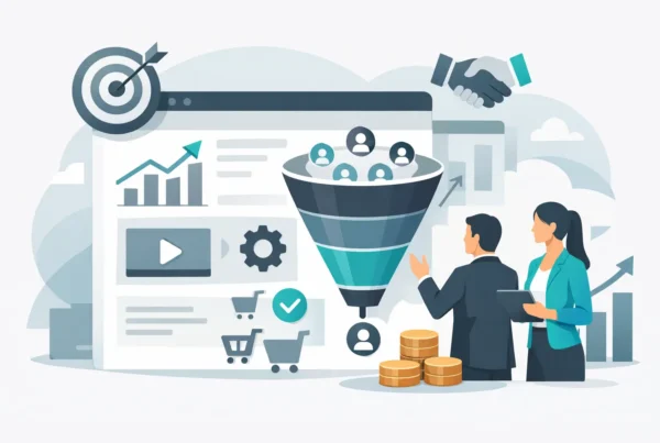
Make the offer stronger, not just the page prettier
If your landing page is clean, fast, and clear but still underperforming, the problem may be the offer itself. This is where many teams get stuck. They tweak layouts and headlines when the real issue is that the value exchange is weak.
A visitor is always asking a simple question: why should I do this now? Your offer has to answer that with enough force to overcome delay, distraction, and skepticism.
Sometimes the fix is reframing the offer. A generic “contact us” call to action often underperforms compared to something more tangible, like booking a strategy session, requesting a tailored quote, or getting a performance review. The more concrete the next step, the easier it is for people to say yes.
Sometimes the fix is reducing perceived risk. That could mean clearer expectations, a stronger explanation of what happens after submission, or proof that your process is straightforward and worthwhile. People convert more easily when the next step feels low drama and high value.
Use proof where decision tension is highest
Social proof works best when it answers doubt at the exact moment doubt appears. A testimonial placed randomly on the page might look nice, but proof tied to a specific claim is far more effective.
If you say your process drives better lead quality, show evidence near that message. If you claim faster launch timelines, support it with a real result. If you ask for a consultation booking, include reassurance about what that call includes and who it is for.
Proof also needs to feel believable. Generic praise like “great team” or “highly recommend” is better than nothing, but detailed proof carries more weight. Specific outcomes, recognizable business context, and concrete before-and-after language create confidence.
Authority should feel earned, not inflated
Decision-makers are quick to spot overstated claims. A landing page does not need to shout to be persuasive. It needs to demonstrate command. Strong positioning, sharp visuals, credible results, and precise messaging usually outperform hype.
This is especially true for service businesses selling strategic work. Buyers are not just evaluating style. They are evaluating whether you understand business goals, customer behavior, and execution risk.
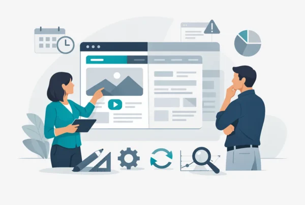
How to improve landing conversions with better page structure
Most people do not read a landing page top to bottom. They scan, pause, jump, and evaluate in fragments. Your structure should support that behavior rather than fight it.
The page should move in a clean sequence: what this is, who it is for, why it matters, why you are credible, and what to do next. If that logic breaks, conversions usually do too.
A common mistake is overloading the top section with too many ideas. Another is burying the call to action under long blocks of copy with no visual hierarchy. Great landing pages create rhythm. They let people understand the offer at a glance, then go deeper if they need more confidence.
Subheads matter here. So does spacing. So does visual contrast. Conversion design is not decoration. It is decision architecture.
Test the right things in the right order
Testing matters, but random testing wastes time. If you want to know how to improve landing conversions in a meaningful way, prioritize bigger levers before smaller ones.
Start with the headline, the offer, the call to action, the form length, and the overall layout. These elements shape intent and behavior more than minor cosmetic changes. Button color tests are fine, but they rarely fix structural conversion problems.
It also helps to look beyond conversion rate alone. A page can generate more form fills and still hurt the business if lead quality drops. That is why the best optimization work connects page performance to sales outcomes, not just top-line metrics.
Not every drop in conversion is a page problem
Sometimes the page is fine and the traffic is weak. A campaign targeting broad keywords or vague audiences can lower conversion rates even if the landing page is solid. The opposite is also true. Strong intent traffic can make a mediocre page look better than it is.
That is why smart optimization looks at the full path, not just the page in isolation. Source quality, audience targeting, creative alignment, and page experience all shape results together.
Conversion gains compound when brand and UX align
The best-performing landing pages do not feel like stitched-together campaign assets. They feel like a focused extension of a strong brand. The messaging is clear. The visuals support the promise. The user experience removes hesitation. The offer feels relevant and commercially smart.
That combination is where real gains happen. Not in one magic trick, but in a series of aligned choices that make saying yes easier.
For growth-focused businesses, this is the bigger opportunity. A stronger landing page does more than lift a campaign metric. It improves the return on every traffic source feeding it, sharpens your positioning, and creates a more efficient path from interest to inquiry.
If your page is getting attention but not enough action, do not assume you need more traffic. You may just need a clearer promise, a better offer, and a page built to convert like your growth depends on it – because it does.