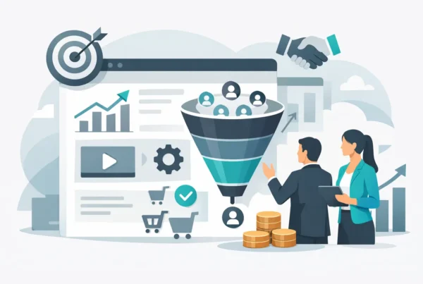
A lot of businesses do not have a traffic problem. They have a conversion problem.
That distinction matters because lead generation landing pages are often treated like isolated design assets when they are really conversion systems. If the message is vague, the offer is weak, the form asks too much, or the page feels generic, more traffic just means more wasted opportunity. The page might look polished and still underperform where it counts.
The strongest landing pages do one job with total clarity. They connect a specific audience to a specific offer and remove friction between interest and action. That sounds simple, but the gap between a decent page and a high-performing one is usually strategy, not decoration.
What lead generation landing pages are really supposed to do
A lead generation landing page is not a mini homepage. It is not a place to explain everything your company does. It is not a catch-all destination for every audience, service, and campaign.
Its job is narrower and more valuable than that. It needs to persuade the right visitor to take the next step, whether that means booking a consultation, requesting a quote, signing up for a demo, or downloading a useful resource.
That focus changes how the page should be built. Every section, headline, visual, and form field should support one conversion goal. The moment a page tries to serve too many goals, performance usually drops. Visitors hesitate when the path is unclear, and hesitation is expensive.
Why so many landing pages fail
Most underperforming pages do not fail because of one dramatic flaw. They fail because of stacked friction.
The headline is broad. The value proposition sounds like everyone else. The form is longer than it needs to be. The call to action is generic. The design looks acceptable but does not guide the eye. Proof exists, but it is buried. Mobile spacing is awkward. Load time is a little slow. None of these issues seem fatal alone, but together they drain momentum.
There is also a common strategic mistake: businesses build pages around what they want to say instead of what the buyer needs to believe. Buyers are not asking whether your company offers great service and innovative solutions. Every competitor says that. They are asking whether you understand their problem, whether your offer is relevant, and whether taking action feels worth the effort.
That is where better positioning beats louder promotion.
The anatomy of lead generation landing pages that convert
High-performing pages usually feel obvious to the visitor. Not because they are simplistic, but because the page answers key questions in the right order.
A headline with a real promise
Your headline should make the value of the offer instantly clear. Not clever. Clear.
A strong headline names the outcome, the audience, or the problem being solved. If someone lands on the page from a paid ad, search result, or email, the message should feel consistent with the expectation that got them there. Message match is not a small detail. It is one of the fastest ways to reduce bounce and improve trust.
A subheading that adds context
The subheading should do the work the headline cannot carry alone. This is where you can clarify who the offer is for, how it works, or why it is different. Good subheadings reduce ambiguity. Great ones reduce resistance.
A call to action that tells people what happens next
“Submit” is not a strategy.
The best calls to action are specific and low-friction. “Book Your Free Strategy Call” or “Get a Custom Quote” gives the user a clearer picture of the next step. That clarity lowers anxiety, especially when the conversion requires time or personal information.
A form that earns the ask
Every field in a form is a cost. The question is whether the information you request is worth the drop-off it creates.
For some businesses, a short form will generate more volume but lower quality. For others, a more detailed form helps qualify leads and improve sales efficiency. It depends on your sales process, average deal value, and follow-up capacity. There is no universal right length. There is only the right trade-off for the business model.
Proof placed before doubt takes over
Testimonials, client logos, certifications, case study snippets, and performance outcomes all help, but placement matters. Social proof should appear before the visitor starts questioning whether the offer is credible. Waiting until the bottom of the page can be too late.
Design that supports decision-making
Good landing page design is not about adding more visual energy. It is about directing attention. Strong hierarchy, disciplined spacing, readable type, and intentional contrast all help the visitor move through the page without friction.
When design is working, the page feels easier to use and easier to trust.
The messaging mistake that hurts conversion most
The biggest messaging problem on landing pages is sameness.
If your page says you deliver tailored solutions, customer-focused service, and innovative results, you are describing a company in the vaguest possible terms. Buyers do not convert on adjectives. They convert on relevance.
Specificity is what makes a page persuasive. Name the audience. Name the pain point. Name the outcome. If you help manufacturers reduce manual quoting delays, say that. If you help service businesses generate qualified consultations instead of low-intent form fills, say that.
The more precisely a page reflects the visitor’s context, the less work they have to do to connect your offer to their needs.
This is one reason persona development and competitor analysis matter before design begins. A landing page should not be built from generic assumptions. It should be shaped by market reality.
Design and UX are not separate from performance
There is a persistent myth that design makes things look good while marketing makes them convert. In practice, the two are tightly linked.
A page with weak UX can sabotage a strong offer. A page with muddy visual hierarchy can bury your call to action. A page that looks dated can lower perceived credibility even if the copy is solid. And a page that loads slowly on mobile can lose leads before the value proposition is even seen.
That is why the strongest landing page work sits at the intersection of brand, UX, copy, and technical execution. Businesses that treat those pieces separately often end up with pages that are attractive but underpowered, or highly optimized but forgettable.
The best lead generation landing pages do not force a choice between brand quality and conversion performance. They use both.
What to test before you redesign everything
When conversion rates are disappointing, a full redesign is not always the first move. Sometimes a smaller set of changes creates a meaningful lift.
Start with the headline and call to action. If the promise is unclear or the next step feels vague, nothing else on the page can fully compensate for that. Then look at the form length, proof placement, and mobile experience. These are common friction points with outsized impact.
Offer strength also deserves scrutiny. If the page is promoting a weak reason to act, better design alone will not rescue it. A consultation framed around a concrete business outcome will often outperform a generic “contact us” page because the value exchange is clearer.
Testing matters here, but random testing wastes time. The most useful experiments come from informed hypotheses. Change what likely affects buyer confidence, not just what is easiest to tweak.
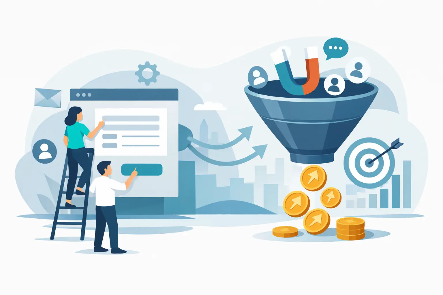
When one landing page is not enough
A lot of businesses try to send multiple audiences to one page. That usually creates diluted messaging.
If you serve different industries, offer multiple services, or target buyers at different stages, separate landing pages can outperform a single general page by a wide margin. A founder looking for brand positioning does not need the same message as a marketing director looking to improve demo conversions. Intent shapes what the page should say.
This is especially true for paid traffic. The tighter the connection between ad, keyword, audience, and landing page, the better your odds of conversion. Precision improves performance.
That does not mean every campaign needs a completely custom experience. It means the page should reflect the intent behind the click.
The real goal is not more leads
More leads sounds good until the sales team is sorting through low-fit inquiries.
The best landing pages improve lead quality as much as lead volume. They set expectations, clarify the offer, and help the right prospects self-identify. That may reduce raw submissions in some cases, but it often improves close rates and sales efficiency.
That is a better business outcome.
For growth-focused companies, this is the real opportunity. Landing pages should not just collect contact information. They should create momentum between marketing and revenue. That takes strategy, tight execution, and a willingness to refine what the data is actually saying.
A high-converting page is rarely the product of one smart tactic. It is what happens when messaging, design, UX, and performance thinking all move in the same direction. If your current page is falling short, the fix is usually not more noise. It is more clarity.
Frequently asked questions (FAQs)
What's the difference between a conversion problem and a traffic problem?
A traffic problem means you don’t have enough visitors; a conversion problem means your visitors aren’t taking action. Many businesses actually have a conversion problem—more traffic to a poorly optimized landing page just wastes opportunity. The solution is building a conversion system with clear messaging, a strong offer, and minimal friction rather than simply driving more traffic.
Why do most landing pages fail to convert visitors?
Most landing pages fail due to stacked friction—a combination of issues like vague headlines, lengthy forms, buried social proof, and unclear calls to action that accumulate to kill momentum. Another common mistake is building pages around what the business wants to say instead of addressing what buyers need to believe about their specific problem and your relevance to solving it.
What elements should a high-converting landing page include?
A high-performing landing page needs a clear headline with a real promise, a subheading that adds context, a specific call to action that describes the next step, a form that doesn’t ask for unnecessary information, social proof placed early in the page, and design that guides attention and supports decision-making without friction.
How long should a landing page form be?
There’s no universal ideal form length—it depends on your sales process, deal value, and follow-up capacity. A shorter form generates more volume but lower-quality leads, while a longer form qualifies prospects better and improves sales efficiency. The right trade-off depends on what matters most for your specific business model.
Why is specificity more important than adjectives on landing pages?
Generic adjectives like “tailored solutions” and “customer-focused service” describe every competitor, so they don’t persuade buyers to act. Specificity—naming your exact audience, their pain point, and the concrete outcome you deliver—makes the page relevant to visitors and requires less mental work for them to see how your offer solves their problem.
Should I redesign my entire landing page if conversion rates are low?
Not necessarily. Start by testing your headline and call to action first, as unclear promises and vague next steps undermine everything else on the page. Then examine form length, social proof placement, and mobile experience. Only pursue a full redesign after identifying which specific elements are creating friction and testing informed changes to address them.