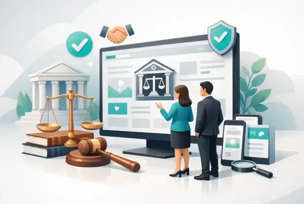



A corporate law firm can lose credibility in under ten seconds online. Not because its attorneys lack experience, but because the website feels vague, dated, or harder to use than it should be. In corporate law website design, that gap matters. Sophisticated clients are not just reviewing your credentials. They are judging how clearly you think, how confidently you present risk, and whether your firm looks equipped to handle serious business.
That is the real job of a law firm website in this space. It is not there to win design awards for the sake of it. It is there to signal competence, reduce doubt, and move the right prospective clients from cautious interest to actual inquiry.
Corporate law has a particular website problem. Many firms either lean too far into tradition and end up looking frozen in time, or they overcorrect with trendy visuals that feel more startup than legal counsel. Neither approach serves the buyer. General counsel, founders, executives, and investors are not looking for visual theater. They are looking for signs of judgment.
What corporate law website design needs to do
A strong site for a corporate law practice has to do three things at once. It needs to establish authority, make complex services easier to understand, and create a friction-free path to contact. Miss one of those, and performance slips.
Authority starts before anyone reads a word. Layout, spacing, typography, page speed, and structure all shape trust. If the site feels cluttered or inconsistent, visitors assume the experience of working with the firm may be similar. Fair or not, that is how digital perception works.
Clarity matters just as much. Corporate law firms often serve across M&A, governance, entity formation, securities matters, contracts, employment issues, compliance, and private equity transactions. To the firm, those categories are obvious. To a prospective client under pressure, they are often not. Good website design helps people find themselves quickly without forcing them to decode internal practice-area language.
Then there is conversion. Not every visitor is ready to schedule a call today, and that is fine. But every serious website should make the next step obvious. If someone has to hunt for a contact path, wonder who the firm works with, or guess whether their matter is a fit, the site is making the sale harder than it needs to be.
The best corporate law websites feel calm, not flashy
There is a reason many high-performing professional service websites share a certain restraint. Calm design reads as controlled. In law, control is persuasive.
That does not mean boring. It means intentional. A confident corporate law website design approach usually favors strong typography, disciplined use of color, sharp hierarchy, and clean page composition over gimmicks and animation-heavy experiences. The goal is to create a sense of precision.
This is one of those areas where trade-offs matter. A site that looks too conservative can feel forgettable. A site that tries too hard to appear modern can weaken trust with institutional buyers. The answer usually sits in the middle: contemporary design with professional gravity.
The strongest firms understand that luxury and credibility are often quiet. They do not need a homepage that performs acrobatics. They need one that communicates expertise fast.
Messaging is doing more work than most firms realize
Many legal websites look respectable at first glance and still underperform because the copy says almost nothing. Phrases like “trusted advisors” and “client-focused counsel” are not wrong. They are just invisible. Every competitor says some version of the same thing.
Your website has to answer sharper questions. What kinds of companies do you advise? At what stage? On which transactions or legal issues? What is different about how your firm works? What kind of responsiveness or business understanding should a client expect?
This is where strategy and design need each other. Good visuals can earn attention, but clear positioning earns confidence. If a founder lands on your site during a financing round, they should immediately understand whether your firm handles that kind of work. If an established company needs outside counsel for governance or acquisition activity, the path to that answer should be obvious.
Specificity converts. Vague elegance does not.
Structure matters more than firms think
Most law firm websites are organized around what the firm wants to say. Better websites are organized around what the client needs to find.
That sounds simple, but it changes everything. Navigation should reflect real user intent, not internal politics or legacy page structures. Practice areas need to be grouped logically. Industry pages can help when they reflect meaningful specialization rather than filler. Attorney bios should be easy to browse and written in a way that balances credentials with human trust.
For corporate law firms, this usually means building a site architecture around a few core journeys. One visitor wants to understand services. Another wants to vet attorney experience. Another wants signs of relevant industry knowledge. Another simply wants to know whether the firm is credible enough to contact.
A well-structured site respects all four paths.
SEO for corporate law websites should support authority, not distort it
Search visibility matters, especially in competitive legal markets. But a lot of SEO advice aimed at law firms creates content bloat, awkward page structures, and copy that sounds like it was written for an algorithm having a bad day.
Corporate law website design should support search performance without turning the site into a keyword warehouse. That means strong technical foundations, clear page intent, useful service content, thoughtful internal structure, and pages that align with how buyers actually search.
It also means accepting that not every page has the same job. Some pages exist to rank. Some exist to convert. Some exist to reinforce trust after the first click. The firms that perform best usually build around that reality instead of forcing every page to do everything.
For legal organizations with complex service lines, topical depth helps. A main corporate law page can establish scope, while supporting pages explore specific services such as mergers and acquisitions, governance, contract matters, or startup counsel. Done well, that structure helps both users and search visibility.
Design details that actually affect lead quality
A better-looking site can increase inquiries. A smarter site can improve the quality of those inquiries.
That distinction matters. If your firm handles high-value corporate matters, you do not need more random form fills. You need more qualified opportunities.
Several design choices influence that outcome. Clear service descriptions help visitors self-select. Strong calls to action reduce hesitation. Attorney pages that show depth without reading like résumés help prospects picture the working relationship. Contact forms should ask enough to add context, but not so much that they feel like an intake exam.
Social proof also matters, though it has to be used carefully in law. Representative clients, deal experience, speaking engagements, publications, recognitions, and case-related credibility signals can all strengthen trust when presented with restraint. Too much self-congratulation feels defensive. Too little proof feels thin.
Then there is mobile. Even in B2B legal, mobile performance is not optional. Busy executives review firms between meetings, during travel, and after hours. If the mobile experience is clumsy, confidence drops fast.
Why many redesigns fail
The usual reason is simple: the project focuses on appearance while ignoring positioning, content, and conversion behavior.
A new visual layer on top of weak messaging rarely changes business results. Neither does a technically polished site built without understanding how buyers evaluate legal counsel. The website ends up prettier, but not more persuasive.
The better approach starts earlier. Before design concepts, there should be real thinking around audience segments, service priorities, competitive differentiation, and what the site needs to accomplish commercially. That is less glamorous than picking fonts. It is also where the value lives.
This is especially true for firms with multiple partners or broader service offerings. Without a clear strategic framework, the website becomes a compromise document. And compromise documents tend to sound like nobody in particular.
A good agency will challenge that. Politely, of course.
What to prioritize if your current site is underperforming
If your website is not pulling its weight, resist the urge to treat it as a cosmetic issue first. Start by asking harder questions. Does the site clearly explain what the firm does and who it serves? Does it feel current and credible? Can visitors move through it without friction? Does it create confidence quickly?
If the answer is inconsistent, the redesign should address strategy, messaging, UX, SEO, and development together. That is usually where real gains come from. Firms that treat those as separate tracks often end up paying twice.
For growth-focused legal organizations, the website is not just a brochure. It is a business development asset, a credibility filter, and often a prospect’s first serious interaction with the firm. That is why corporate law website design deserves more than surface-level thinking.
The firms that win online are not always the biggest or oldest. They are often the clearest, the most credible, and the easiest to trust. If your website can communicate that without trying too hard, it is already doing more than most.
Frequently asked questions (FAQs)
What makes a corporate law firm website lose credibility quickly?
A corporate law website can lose credibility in under ten seconds if it feels vague, outdated, or difficult to navigate. Sophisticated clients judge not just your credentials, but how clearly you think, how you present risk, and whether your firm appears equipped to handle serious business matters. Poor layout, slow page speed, inconsistent design, and unclear messaging all signal a lack of competence before visitors read a word.
What are the three main things a corporate law website must do?
A strong corporate law website must establish authority through professional design and fast page speed, make complex services easy to understand through clear language and logical organization, and create a friction-free path to contact. Missing any one of these elements will reduce your site’s performance and lead generation quality.
How should corporate law websites be designed for maximum credibility?
The best corporate law websites favor restraint over flashiness, using strong typography, disciplined color use, sharp hierarchy, and clean composition rather than animations and gimmicks. This calm, intentional approach communicates precision and control—qualities that build trust with institutional buyers and high-value prospects. The goal is contemporary design with professional gravity, not forgettable conservatism or design that tries too hard to appear modern.
Why is specific messaging more important than generic legal phrases on a law firm website?
Generic phrases like “trusted advisors” and “client-focused counsel” are invisible because every law firm uses them. Your website must answer sharper questions: What kinds of companies do you advise? At what stage? On which transactions? What is different about your firm? Specificity converts prospects into leads, while vague elegance does not—a founder reviewing your site during financing should immediately know if you handle that work.
How should a corporate law firm website be organized?
Websites should be organized around what clients need to find, not what the firm wants to say. Navigation should reflect real user intent, practice areas should be grouped logically, and the site architecture should support multiple core journeys: understanding services, vetting attorney experience, finding industry knowledge, and assessing firm credibility. This approach respects how different visitors search for information.
What design details improve the quality of leads from a law firm website?
Clear service descriptions help visitors self-select for fit, strong calls to action reduce hesitation, and attorney pages that show depth without reading like résumés help prospects envision the working relationship. Contact forms should ask enough to add context without feeling like an intake exam, social proof should be presented with restraint, and mobile experience must be seamless since busy executives review firms between meetings and after hours.