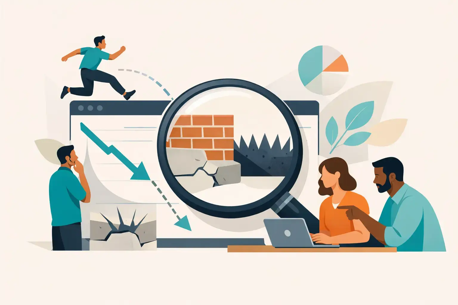
A high bounce rate can feel like a verdict on your website: people arrived, took one look, and left. Sometimes that is exactly what happened. Other times, the metric is exposing a reporting problem, a mismatched campaign, or a page that answered a visitor’s question faster than expected.
For growth-focused businesses, the useful question is not whether the number looks bad in a dashboard. It is why is bounce rate high for this audience, on this page, from this source, right now? That distinction keeps teams from redesigning pages that are working and helps them find the friction that is quietly costing qualified leads.
Why Is Bounce Rate High? Start With the Definition
In Google Analytics 4, bounce rate is the percentage of sessions that were not engaged. An engaged session lasts longer than 10 seconds, includes a conversion event, or contains at least two page views. Bounce rate is effectively the inverse of engagement rate.
That is a meaningful shift from older analytics platforms, where a bounce generally meant one page view and no additional interaction. The new definition is more useful, but it still needs context. A visitor who lands on a phone number page, calls your office in six seconds, and leaves may be a successful visit even if it appears as a bounce. A visitor who reads a 2,000-word article and exits after 45 seconds is not necessarily a lost opportunity either.
The metric becomes valuable when it sits beside conversion events, scroll depth, engagement time, form starts, calls, and traffic source. A high bounce rate plus low conversions is a problem worth investigating. A high bounce rate plus strong calls, bookings, or qualified form submissions may simply reflect how people use that page.
The Most Common Reasons Visitors Leave
Your message does not match the reason they clicked
This is often the biggest issue, and it has nothing to do with button colors. Someone searching for “UX design for SaaS” expects immediate evidence that you understand SaaS product complexity, onboarding, user flows, and growth constraints. If they land on a broad agency page filled with vague claims about creativity, they have to work too hard to connect the dots.
The same applies to paid campaigns, social posts, referral traffic, and branded searches. Your ad, search snippet, or referral context makes a promise. The landing page needs to continue that conversation in its opening screen with a clear headline, relevant proof, and an obvious next step.
A polished page can still underperform when its message is one step behind the visitor’s intent. Good design earns attention. Clear relevance keeps it.
The traffic is not qualified
Not all visits deserve the same level of concern. Broad informational keywords can attract people who are researching, students looking for definitions, competitors, job seekers, or businesses far outside your ideal client profile. A high bounce rate from this group may be expected.
Before changing a page, segment the data. Compare bounce rate and conversions by channel, campaign, device, location, landing page, and new versus returning users. One underperforming paid campaign can distort the site-wide number. So can a blog post that ranks for a loosely related term.
The goal is not to drive any traffic. It is to attract the right traffic with a reason to continue. More unqualified sessions can make a dashboard look busy while making pipeline performance worse.
The page is slow, unstable, or difficult to use
Visitors are rarely patient enough to diagnose a technical problem. They just leave. Slow load times, shifting layouts, delayed menus, oversized media, and clumsy mobile interactions all create doubt before your value proposition gets a fair hearing.
Mobile deserves special scrutiny. Many B2B teams still review their websites mainly on large monitors, while prospects first encounter the site between meetings on a phone. If the headline wraps awkwardly, the navigation covers content, a form is tedious to complete, or a key case study is hard to scan, the experience feels less credible.
Speed optimization is not merely a technical cleanup task. It protects the first impression your brand has already paid to create through search, advertising, referrals, and reputation.
Visitors cannot quickly see what is in it for them
A homepage or service page should not make people hunt for basic answers: What do you do? Who is it for? What business problem do you solve? Why should they believe you? What should they do next?
Many high-bounce websites bury those answers under generic positioning, oversized hero visuals, clever headlines that explain very little, or a wall of services with equal visual weight. The result is a page that looks considered but feels directionless.
Clarity is not the enemy of sophistication. For a professional service firm, SaaS company, architecture practice, or technology consultancy, a clear point of view usually feels more premium than a vague one. Visitors should understand your relevance before they need to scroll.
The next step has too much friction
Not every visitor is ready to book a meeting. But every high-intent page should offer a logical progression, whether that is reviewing work, reading a relevant case study, seeing the process, comparing service options, or starting a conversation.
When a page has no meaningful path forward, people exit. When it has five competing calls to action, they exit for a different reason: decision fatigue. A strong conversion path gives visitors one primary action and a few supporting routes based on where they are in the decision process.
Forms can also create unnecessary resistance. Asking for detailed budgets, timelines, job titles, company sizes, and project briefs before someone has built confidence is a familiar way to lose early interest. Gather what your team genuinely needs at that stage, not every field someone thought might be useful later.
How to Diagnose a High Bounce Rate Without Guessing
Start with the landing pages that receive meaningful traffic and have a commercial role. A service page with 800 visits and no conversions deserves more attention than a low-traffic article with a high bounce rate. Then view each page through three lenses: acquisition, experience, and outcome.
For acquisition, ask where visitors came from and what expectation brought them there. Review search queries, ad copy, referral sources, campaign targeting, and the language used in social or email promotions. If the source promise and page content are misaligned, fixing the page alone will only solve half the issue.
For experience, review the page on actual devices, especially mobile. Check load behavior, navigation, visual hierarchy, readability, form usability, and the point at which critical information appears. Session recordings and heat maps can be useful here, but treat them as evidence, not theater. A colorful heat map is not a strategy.
For outcome, look beyond bounce rate. Are visitors scrolling? Clicking a phone number? Opening case studies? Starting forms? Returning later? A visitor who does not submit on the first session may still be evaluating a complex service purchase. This is why clean event tracking matters. If conversions and meaningful interactions are not configured correctly, your team is making decisions with an incomplete picture.
Fix the Highest-Impact Friction First
The best improvements usually begin above the fold. Strengthen the headline so it reflects the visitor’s problem and desired outcome. Add concise proof near the claim, such as relevant results, recognizable client types, a specific methodology, or an example of the work. Make the primary action unmistakable.
Next, improve the page’s information flow. Put the most decision-relevant content first, then answer likely objections as the visitor moves down the page. This may include your approach, project scope, examples, process, differentiators, and a clear invitation to talk. The exact order depends on the service and audience. A founder assessing a new product partner needs different reassurance than a legal operations leader evaluating a firm-wide website redesign.
Technical improvements should run alongside messaging work, not after it. Compress and properly deliver media, reduce unnecessary scripts, stabilize layouts, and test interactive elements across devices. A faster page will not rescue a weak offer, but it prevents a strong offer from being ignored.
Finally, test changes with discipline. Change one major variable or a tightly related group of elements, establish a review period, and judge performance through qualified conversions rather than bounce rate alone. Chasing a lower percentage for its own sake can produce worse business results. For example, forcing visitors through extra clicks may reduce bounces while making it harder to contact you.
A Better Standard Than a Lower Number
The real job of a website is not to keep every visitor around longer. It is to help the right visitor move forward with confidence. For some pages, that means reading, comparing, and exploring. For others, it means getting an answer quickly and making a call.
Treat bounce rate as an early signal, not a final judgment. When you pair it with intent, behavior, technical performance, and conversion quality, the number stops being a source of anxiety and becomes a useful prompt: where is your digital experience asking the right people to work too hard?
Frequently asked questions (FAQs)
What is considered a bounce rate in Google Analytics 4, and why does the definition matter?
In Google Analytics 4, bounce rate is the percentage of sessions that were not engaged—meaning sessions lasting less than 10 seconds without a conversion event or additional page views. This definition differs from older platforms and matters because a high bounce rate doesn’t always mean a problem; a visitor who calls your business in six seconds or finds immediate answers may represent success despite appearing as a bounce.
What is the most common reason visitors bounce from a website?
The most common reason is message-intent mismatch: when a visitor’s expectation (based on search query, ad copy, or referral context) doesn’t align with what they find on the landing page. If someone searches for specialized expertise but lands on generic content, they leave because they must work too hard to verify relevance. Clear, immediate relevance in the opening screen—through headline, proof, and next steps—is essential to keep attention.
How should I analyze bounce rate to avoid making wrong decisions about my website?
Segment your data by channel, campaign, device, location, landing page, and user type to isolate the real problem. A high site-wide bounce rate might reflect one underperforming paid campaign or a blog post ranking for loosely related keywords, not a site-wide issue. Compare bounce rate alongside conversions, calls, form submissions, and scroll depth to determine whether the metric reflects poor traffic quality, misaligned messaging, or actual visitor success.
How does page speed and mobile experience affect bounce rate?
Visitors leave before diagnosing technical problems—slow load times, layout shifts, delayed menus, and poor mobile navigation create doubt before your value proposition is heard. Mobile deserves special attention since many B2B prospects first encounter your site on phones between meetings; awkward headlines, navigation covering content, and tedious forms all damage credibility and increase bounces.
What information should appear above the fold to reduce bounce rate?
Visitors should immediately understand: what you do, who it’s for, what problem you solve, why they should believe you, and what to do next. Generic positioning, oversized visuals, or clever but unclear headlines make pages feel directionless. A clear point of view—especially for professional services—is more premium and persuasive than vague messaging and reduces the bounce rate by providing instant relevance.
How should I structure the conversion path on a page to reduce bounces?
Offer one primary action with a few supporting routes based on where visitors are in the decision process. Avoid decision fatigue from five competing calls to action or unnecessary form friction early in the journey. Let visitors progress logically—reviewing work, reading case studies, understanding your process—before asking for detailed information, and only gather what your team genuinely needs at that stage.