A lot of B2B websites look polished and still underperform. The problem usually is not the color palette or the animation. It is that the site fails at the moments that matter most – clarifying value, proving credibility, and making the next step obvious. If you are evaluating the best b2b website features, that is the lens to use: not what looks current, but what moves a buyer closer to action.
B2B buying is rarely impulsive. Your visitors are comparing vendors, building internal consensus, checking for risk, and trying to understand whether your team can solve a very specific problem. A high-performing website has to support that process. It needs to work as a sales tool, a trust signal, and a positioning asset at the same time.
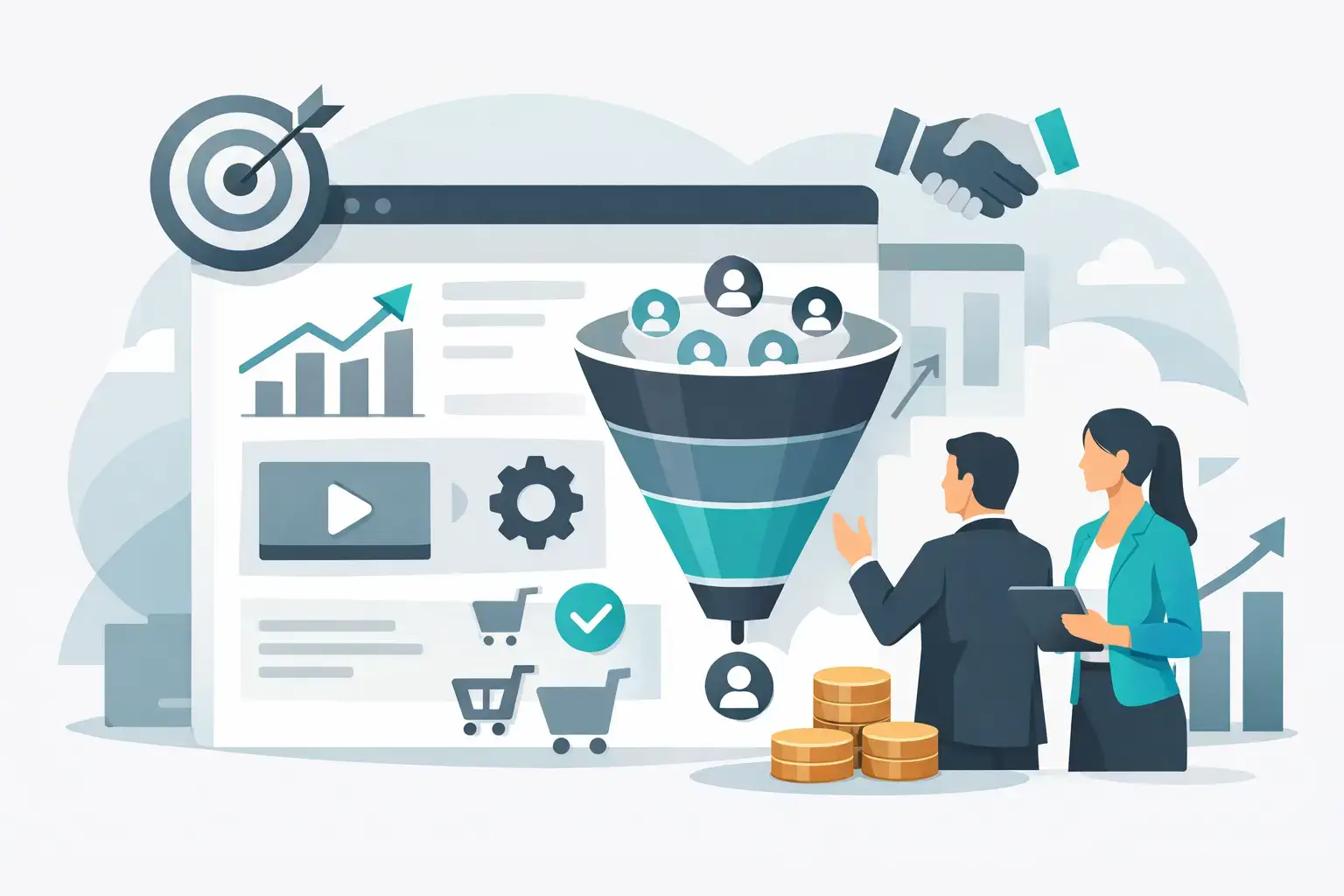
What the best B2B website features actually do
The best B2B website features are not random additions. They reduce friction in the buyer journey. They answer questions before a sales call. They help the right prospects qualify themselves in, and the wrong ones qualify themselves out.
That last point matters more than many companies realize. More leads is not always the win. Better-fit leads, shorter sales cycles, and stronger close rates usually matter more. Good website strategy reflects that reality.
1. Clear positioning above the fold
When someone lands on your homepage, they should understand three things within seconds: what you do, who it is for, and why your approach is different. That sounds simple, but it is where many B2B sites fall apart.
Generic headlines about innovation, growth, or solutions do not carry enough weight. Decision-makers are scanning for relevance. If your messaging is broad enough to apply to any competitor, it is not doing its job.
Strong positioning above the fold pairs a sharp headline with a short supporting statement and one primary call to action. In some cases, adding a secondary CTA for visitors who are not ready to talk yet can help. The trade-off is focus. Too many options dilute attention.
2. Navigation built around buyer intent
Navigation should make it easy for prospects to find what they need based on where they are in the decision process. That usually means organizing around problems, services, industries, or outcomes rather than internal company language.
A visitor should not have to decode your org chart to understand your offer. If your menu labels are clever but vague, clarity loses. On the other hand, if your navigation becomes too exhaustive, people get overwhelmed.
The sweet spot is a structure that feels obvious. Service pages for buyers evaluating capabilities. Industry or use-case pages for buyers looking for fit. About and results pages for buyers assessing trust. Contact options for buyers ready to move.
3. Service pages with depth, not filler
One of the best b2b website features is a set of service pages that actually sell. Not by sounding aggressive, but by being useful.
A strong service page explains the problem, outlines the approach, shows what success looks like, and gives the visitor a clear next action. It also addresses objections before they become blockers. What is included? Who is it for? How long does it take? What makes this different from alternatives?
Thin pages hurt performance in two ways. They make SEO harder, and they leave buyers with too many unanswered questions. At the same time, adding paragraphs of vague copy will not fix that. Depth works when it is specific.
4. Proof that goes beyond testimonials
Testimonials still matter, but they are rarely enough on their own. B2B buyers want evidence. They want to see outcomes, process, and credibility in context.
That can take several forms: case studies with measurable results, client logos, before-and-after examples, certifications, partnership badges, or short proof points embedded across key pages. The format depends on your sales model. A startup selling into enterprise may need more trust layers than a local service business targeting regional growth companies.
The key is distribution. Do not hide all your proof on one page and assume people will find it. Add credibility where doubt is most likely to appear.
5. Calls to action that match buyer readiness
Not every visitor wants a demo right now. Not every visitor should book a call right now, either.
High-converting B2B sites usually give buyers an appropriate next step based on intent. For a ready prospect, that might be booking a strategy call. For someone earlier in the process, it might be viewing work, exploring a service page, or submitting a project inquiry.
This is where a lot of businesses lose momentum. They either push too hard, too early, or they stay too passive and never ask for the conversion. Effective CTAs are direct, visible, and aligned with what the page just helped the user understand.
6. Fast load times and mobile usability
This feature is less glamorous, but it has real commercial impact. Speed affects bounce rates, user trust, search visibility, and conversions. Mobile usability matters even in B2B because buyers are not always doing research from a desk. They check sites between meetings, during travel, and after hours.
A slow site sends the wrong signal. It suggests inefficiency, poor execution, or a lack of attention to detail. For companies trying to sell expertise, that is a costly message.
There is a trade-off here. Rich visuals can strengthen brand perception, especially for design-led or premium businesses. But performance cannot be sacrificed for aesthetics. The strongest sites balance both.
7. Forms that reduce friction
If your conversion form feels like paperwork, expect drop-off.
B2B lead forms should ask for enough information to qualify the inquiry without creating unnecessary resistance. Name, company, email, and a short project field may be enough for many businesses. If your process requires more detail, explain why.
Long forms can work when the buyer has high intent and understands the value of the next step. But on most top-level conversion pages, simpler is better. The goal is to start the conversation, not create a barrier.
8. Content that supports evaluation
Good B2B content is not there to fill a blog. It should help buyers make a decision.
That might include articles answering common pre-sales questions, industry-specific insights, process explainers, comparison pages, or resources that clarify scope and expectations. The point is to remove uncertainty. When your content does that well, it strengthens both search performance and sales readiness.
This is especially useful for businesses with longer sales cycles or more consultative offers. A visitor may need several touchpoints before they are ready to contact you. Useful content keeps the relationship moving.
9. A visible, believable differentiation story
A surprising number of B2B websites never clearly explain why their company is the better choice. They list services. They make claims. They do not build a convincing case.
Differentiation can come from your process, specialization, speed, technology, strategic depth, creative quality, or ability to connect multiple disciplines under one roof. What matters is that the site states it clearly and backs it up.
For example, a company that combines brand strategy, web development, and conversion optimization has a stronger story than one that talks only about design aesthetics. That kind of positioning tells buyers they are not hiring a vendor for a single deliverable. They are hiring a partner built to improve business performance.
10. Analytics and conversion tracking behind the scenes
Some of the best B2B website features are invisible to the visitor but essential to the business. If you are not tracking where leads come from, which pages influence conversions, and where users drop off, you are making decisions with partial information.
A website should be built to learn. That means setting up meaningful conversion events, measuring form completions, monitoring behavior on key pages, and using those insights to improve copy, layout, and user flow over time.
This is where strategy separates itself from decoration. A site is not finished at launch. It should get sharper as real user data comes in.
The best B2B website features depend on your sales model
There is no universal checklist that works the same for every company. A manufacturing firm with a technical sales process needs different content depth than a SaaS company with product-led demos. A regional service business may need stronger local trust signals, while a national brand may need more segmentation by audience or industry.
That is why feature decisions should be tied to how your buyers actually buy. What questions do they ask before a call? What proof do they need? What causes hesitation? What kind of conversion action makes sense at each stage?
Those answers should shape the website. Not trends. Not competitor copying. Not assumptions from a kickoff meeting six months ago.
At Tripsix Design, that strategic layer is where the real lift usually happens. When brand clarity, UX decisions, technical execution, and conversion thinking are working together, a website stops being a brochure and starts pulling its weight.
If your site gets traffic but not traction, the fix is rarely one flashy feature. It is usually a smarter combination of message, proof, structure, and performance. Start there, and your website becomes a growth asset instead of a placeholder.
Frequently asked questions (FAQs)
What makes a B2B website actually convert visitors into leads?
A high-performing B2B website converts by clarifying value, proving credibility, and making the next step obvious. Rather than focusing on aesthetics alone, it should reduce friction in the buyer journey by answering questions before a sales call, helping qualified prospects move forward, and supporting the entire decision-making process—not just pushing for immediate contact.
How should I structure my B2B website navigation?
Organize your navigation around buyer intent and decision stage, not internal company structure. Use clear categories like service pages for evaluating capabilities, industry or use-case pages for assessing fit, about and results pages for building trust, and contact options for ready buyers. The goal is to make it obvious how prospects can find what they need without decoding your org chart.
What should I include on my service pages?
Strong service pages should explain the problem being solved, outline your approach, show what success looks like, address common objections, and include specific details like who it’s for, how long it takes, and what makes your approach different. Depth matters, but only when it’s specific and useful—vague filler copy won’t help SEO or conversions.
How can I build credibility on my B2B website beyond testimonials?
Use multiple proof points distributed across relevant pages: case studies with measurable results, client logos, before-and-after examples, certifications, and partnership badges. Place credibility evidence where doubt is most likely to appear rather than hiding it on a single page. The format depends on your sales model, but the key is showing outcomes and process in context.
What type of call-to-action works best for B2B websites?
Match your CTA to the visitor’s stage in the buying process—not everyone is ready to book a demo. Early-stage visitors might download resources or explore service pages, while ready prospects can book a strategy call. Effective CTAs are direct, visible, and aligned with what the page just taught the user, striking a balance between pushing too hard and staying too passive.
Why do website speed and mobile performance matter for B2B companies?
B2B buyers research on mobile between meetings and after hours, so slow sites send a signal of inefficiency that undermines your credibility. Speed affects bounce rates, user trust, search visibility, and conversions. For companies selling expertise, a slow or poorly designed mobile experience suggests lack of attention to detail—a costly message to send.