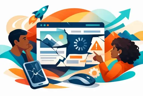

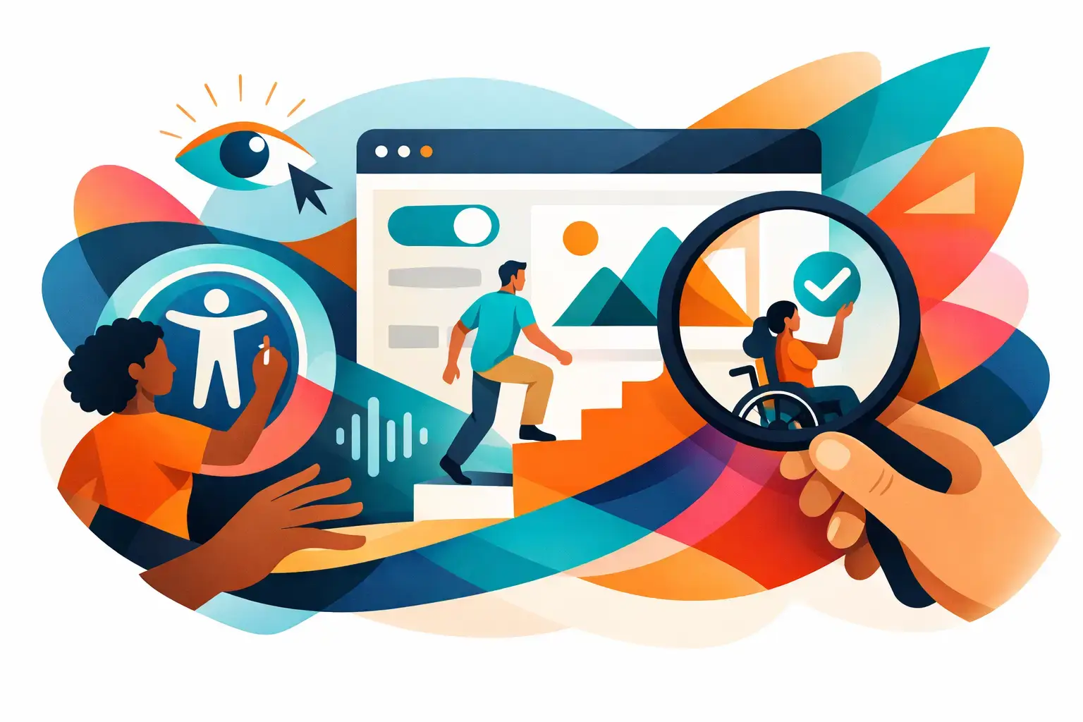
A prospect lands on your website, finds the service they need, and is ready to contact you. Then a form label is missing, a menu cannot be used with a keyboard, or low-contrast text makes the next step hard to see. That is not a minor UX issue. It is a lost opportunity. The best website accessibility practices make your digital experience easier to use for more people while reducing friction for everyone else.
Accessibility is often treated as a compliance task that appears near the end of a redesign. That approach is expensive, limiting, and usually backwards. It belongs in brand strategy, content structure, design, development, and quality assurance from the beginning. Good accessibility is not a separate version of a website. It is a better website.
Why accessibility is a business decision, not a checkbox
For professional service firms, SaaS companies, education organizations, and growing brands, a website has work to do. It must explain value quickly, establish credibility, and make a next step feel easy. When visitors encounter unnecessary barriers, they leave with a poor impression of the business behind the screen.
Accessibility supports clearer navigation, stronger content hierarchy, more usable forms, and better mobile experiences. Those improvements can benefit people using screen readers, keyboard navigation, voice controls, zoom, captions, or high-contrast settings. They also help a visitor with a broken mouse, a noisy office, a bright phone screen, or a short attention span. Real users are rarely operating under perfect conditions.
There is a legal dimension, too. Requirements vary by organization, industry, jurisdiction, and the nature of the service being offered. Meeting recognized Web Content Accessibility Guidelines, commonly called WCAG, is not a blanket legal guarantee. Still, building toward WCAG 2.2 Level AA is a practical benchmark for many organizations and a far more thoughtful position than waiting for a complaint to reveal the gaps.
12 best website accessibility practices for high-performing sites
1. Start with semantic structure
The code beneath a website determines how assistive technologies interpret it. Headings should be actual headings, navigation should be marked as navigation, buttons should be buttons, and content should follow a logical order.
This sounds technical because it is. But the commercial result is simple: visitors can understand and move through your site with less effort. A visually polished page built from generic containers may look right while remaining confusing to a screen reader. Design alone cannot carry the experience.
2. Make every key action keyboard-accessible
Many people navigate without a mouse. They use Tab, Enter, arrow keys, and Escape to move through menus, forms, filters, modal windows, and calls to action. If a user can see a control but cannot reach or operate it with a keyboard, that feature is incomplete.
Test the paths that matter most: your primary navigation, contact form, search, booking flow, resource library, and any interactive product feature. The tab order should make sense, and the focused item should be clearly visible. A faint outline hidden by custom styling is not enough.
3. Use color with enough contrast, but do not rely on it alone
Low-contrast copy has become one of the most common signs that visual taste has outrun usability. Pale gray text may feel understated in a mockup. On a laptop outdoors or a mobile screen at low brightness, it simply disappears.
Use adequate contrast between text and its background, particularly for body copy, form instructions, buttons, and essential information. Also avoid using color as the only signal. If a required field is marked only in red or a chart communicates meaning only through colored lines, some users will miss the point. Add text, patterns, icons, or clear labels.
4. Write alt text that communicates purpose
Alternative text gives meaningful images a verbal equivalent. The operative word is meaningful. A decorative background texture does not need a detailed description. A chart explaining customer growth, a team photo that supports the page message, or a product interface screenshot may.
Good alt text is concise and contextual. It describes what matters on that page, not every visible pixel. For a case study, “Analytics dashboard showing a 42% increase in qualified demo requests” is more useful than “image of a computer screen.”
5. Build forms people can complete without guesswork
Forms are where interest becomes a lead, which makes accessibility a conversion issue in plain sight. Every input needs a persistent label. Placeholder text is not a substitute because it often disappears when someone begins typing.
Give users clear instructions before they submit and specific error messages when something goes wrong. “Please correct the highlighted fields” is vague. “Enter a valid work email address” tells the person what to do next. If a form requires a particular format, state that requirement before the error happens.
6. Create a heading hierarchy that mirrors the page logic
Headings are not just typographic styling. They provide an outline that helps users scan content and jump between sections. A page should generally have one clear H1, followed by H2s for major sections and H3s for supporting ideas.
Do not select heading tags solely because a certain size looks good. Your design system should give each semantic heading a visual treatment that fits the brand. The hierarchy needs to make sense whether someone is reading every word or navigating by headings alone.
7. Design responsive layouts that hold up at high zoom
Responsive design is not finished once a layout looks good on a standard phone and desktop view. Many users increase text size or zoom in substantially. At that point, a fragile layout can create horizontal scrolling, overlapping content, missing controls, or clipped text.
Test key pages at different viewport sizes and magnification levels. Navigation, pricing tables, comparison grids, and dense forms deserve special attention. Some visual complexity may need to simplify on smaller screens. That is not a compromise in quality. It is the difference between a concept and a usable interface.
8. Provide captions, transcripts, and media controls
Video can do serious work for a brand, especially when it demonstrates expertise or makes a technical offer easier to understand. Without captions, however, part of the audience is excluded. Captions also help people watching without sound, which is more common than most teams admit.
Provide accurate captions for video, transcripts for audio-led content, and controls that let users pause, stop, or adjust media. Avoid autoplaying audio. No visitor has ever said, “I wish this consulting website surprised me with sound at 9:15 in the morning.”
9. Give users control over motion and time limits
Animation can guide attention, reinforce a brand system, or show cause and effect. It can also distract, trigger discomfort, or make content impossible to read. The answer is not to eliminate motion entirely. It is to use it with discipline.
Avoid flashing content, respect reduced-motion preferences, and give users a way to pause moving elements when needed. If a session, form, or booking workflow has a time limit, warn people clearly and offer a practical extension where possible.
10. Treat menus, modals, and widgets as high-risk components
The most expensive accessibility issues often hide in interactive components: mega menus, cookie banners, chat tools, calendars, accordions, sliders, and pop-up forms. These features are frequently added late, sometimes by third parties, and can interrupt keyboard navigation or confuse screen-reader users.
A modal should move focus into the dialog when opened, keep focus within it while active, and return the user to a sensible place when closed. Menus need readable labels, predictable behavior, and keyboard support. If a third-party tool cannot meet the standard your site needs, its convenience may not be worth the cost.
11. Test with automation and real human behavior
Automated testing tools are useful because they catch common issues quickly, including missing labels, empty links, contrast failures, and structural errors. They do not catch everything. They cannot reliably determine whether alt text is meaningful, whether a page is understandable, or whether a keyboard journey feels logical.
Use automation as a first pass, then test manually. Navigate your site using only a keyboard. Review key flows with a screen reader. Increase zoom. Complete forms on a phone. Better still, include people with disabilities in usability testing when the scope allows. The insight is often sharper than a long audit report.
12. Build accessibility into your operating system
A one-time remediation project can solve visible issues, but new content, campaign pages, plugins, and product updates can reintroduce them quickly. Accessibility needs ownership and a repeatable process.
Set standards for design components, content publishing, code review, and QA. Train the people who create pages so they understand how to write useful alt text, preserve headings, and avoid inaccessible patterns. Include accessibility requirements in vendor reviews and new feature planning. This is where good intentions either become a system or disappear into a backlog.
What to prioritize first
If your site has been live for years, trying to fix every issue at once can stall progress. Start where business value and user impact overlap: primary navigation, high-traffic landing pages, lead forms, checkout or booking paths, account portals, and core service pages.
Then address repeatable components. Fixing a form field pattern, button style, or navigation system at the component level is more efficient than repairing the same issue on 40 separate pages. A strategic accessibility audit should identify both immediate barriers and the underlying patterns creating them.
For teams planning a redesign, include accessibility before visual direction is finalized. It is easier to establish contrast, component behavior, content rules, and responsive requirements in the system than to retrofit them after launch. Most website problems get more expensive once they have been designed, developed, approved, and published. This one is no exception.
A website should not ask visitors to work around it just to understand your business or take the next step. Build with clarity, test with care, and treat accessibility as part of how your brand earns trust. That is good design with a longer shelf life.
Frequently asked questions (FAQs)
Why is website accessibility important for my business?
Website accessibility is a business decision, not just a compliance checkbox. It improves navigation clarity, content hierarchy, form usability, and mobile experiences for all visitors—whether they use assistive technologies or face real-world barriers like broken devices or noisy environments. Additionally, poor accessibility creates lost opportunities when prospects encounter unnecessary friction and leave with a negative impression of your business.
What is WCAG 2.2 Level AA and do I need to meet it?
WCAG 2.2 Level AA is a recognized benchmark for web accessibility guidelines that varies by organization, industry, and jurisdiction. While meeting these standards is not a blanket legal guarantee, building toward WCAG 2.2 Level AA is a practical and proactive position that protects your business from accessibility gaps and complaints rather than waiting for problems to be revealed.
How can I make sure users can navigate my website without a mouse?
Ensure every key action is keyboard-accessible by testing primary navigation, forms, and calls-to-action with Tab, Enter, arrow keys, and Escape. The tab order should make logical sense, and focused items must be clearly visible with adequate focus indicators—not faint outlines hidden by custom styling.
What is the most common accessibility mistake on websites?
Low-contrast text is one of the most common accessibility issues, often resulting from prioritizing visual aesthetics over usability. Pale gray text may look understated in design mockups but becomes invisible on outdoor laptop screens or mobile devices at low brightness. Body copy, form instructions, buttons, and essential information should always maintain adequate contrast ratios.
Why are form accessibility and form design so critical?
Forms are where visitor interest converts into leads, making accessibility a direct conversion issue. Every input needs a persistent label (not placeholder text), clear instructions before submission, and specific error messages that tell users exactly what to correct. When forms are accessible and well-designed, they reduce guesswork and increase completion rates.
How should I use headings and structure on my website?
Create a clear heading hierarchy with one H1, H2s for major sections, and H3s for supporting ideas—chosen for semantic meaning, not just visual appearance. This hierarchy helps users scan content and jump between sections whether they’re reading every word or using keyboard navigation, and your design system should give each heading an appropriate visual treatment that fits your brand.