A site can look sharp, load fast, and still shut people out.
That is the real value of a website accessibility compliance checklist. It is not a box-ticking exercise for legal teams. It is a practical way to find where your website creates friction, where users get stuck, and where your brand loses trust, conversions, and reach without realizing it.
For growth-focused businesses, accessibility sits at the intersection of brand credibility, UX quality, and risk management. If your website is part of your sales engine, accessibility is part of performance.
Why accessibility compliance matters beyond legal risk
Most business owners first hear about accessibility because of compliance pressure. That concern is valid. Depending on your industry, audience, and location, noncompliance can expose your company to complaints, demand letters, or costly remediation work under tight deadlines.
But the bigger picture is commercial. Accessibility improves usability for everyone, not just people with permanent disabilities. Clear headings help scanning. Better contrast helps mobile users in bright light. Keyboard-friendly navigation helps power users move faster. Captions help people watching without sound. Cleaner form labels reduce abandonment.
That means accessibility work often supports the same goals as conversion optimization, SEO, and UX refinement. It is not separate from performance. It is part of it.
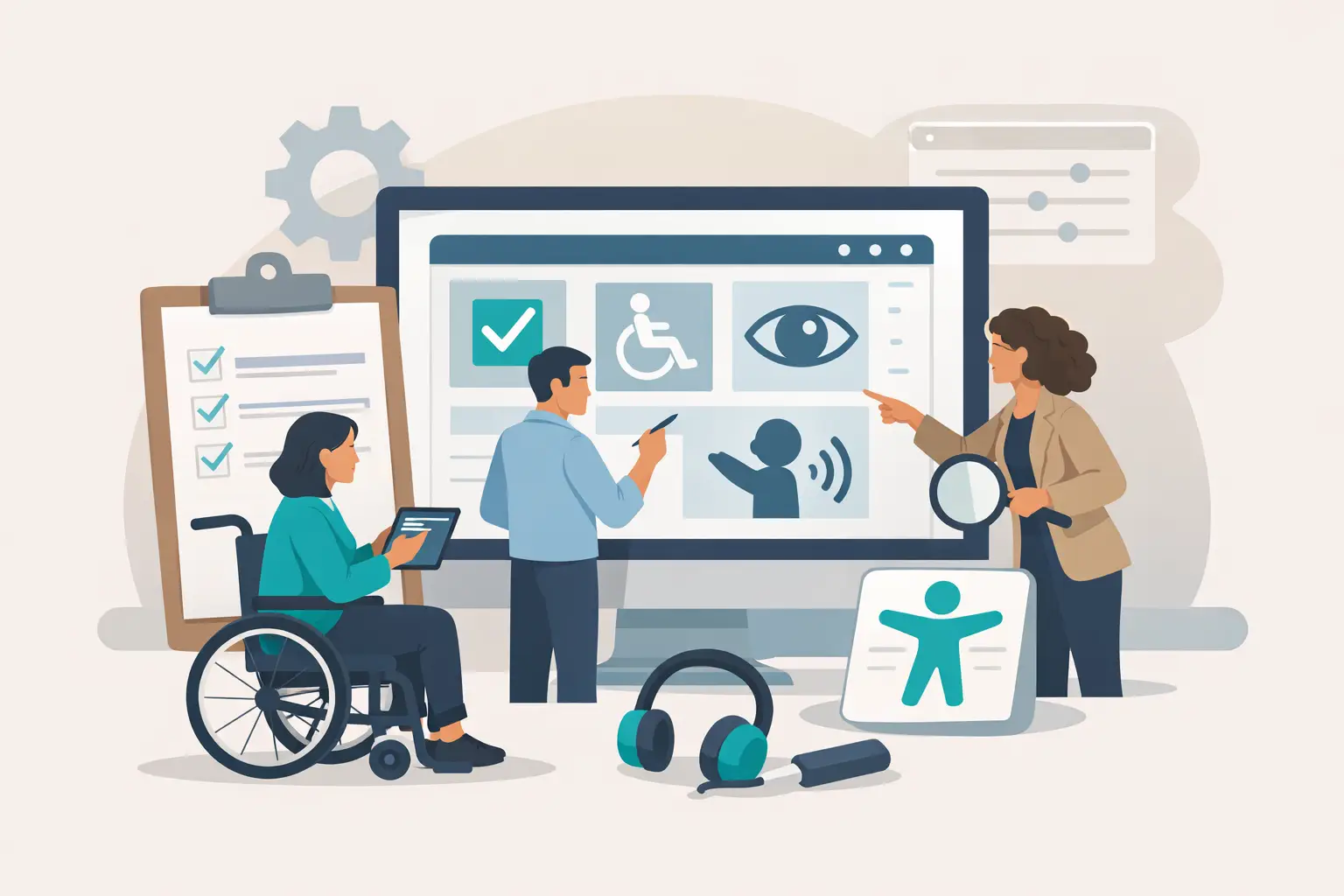
What this website accessibility compliance checklist should cover
A useful checklist should not try to turn every marketer or founder into an accessibility specialist. It should help your team catch the most common issues early, understand what needs expert review, and prioritize fixes based on business impact.
In practice, that means reviewing your site across a few core areas: structure, content, navigation, media, forms, and code behavior. Automated tools can help surface problems, but they do not tell the whole story. Some of the most damaging accessibility failures only show up when a real person tries to use the site with a keyboard, screen reader, or zoom settings.
Start with structure and page hierarchy
Accessibility starts with how a page is organized. If your headings are out of order, your page landmarks are unclear, or the content hierarchy is inconsistent, assistive technology users have to work harder to understand the page.
Check that every page has one clear H1 and a logical heading structure beneath it. Headings should reflect the content, not exist purely for styling. Your navigation, main content, footer, and other key regions should be clearly defined in the code so assistive tools can interpret the layout correctly.
This is one of the first places businesses run into trouble after redesigns. A visually strong layout can still be structurally confusing if the build prioritizes appearance over semantic organization.
Review color contrast and visual clarity
Brand-driven websites often push color hard. That can be a strength, but it can also create accessibility problems fast.
Text needs sufficient contrast against its background to remain readable for users with low vision, color blindness, or temporary visual strain. This includes body copy, headings, buttons, form labels, and hover states. Light gray text on white may look refined in a design file, but on a real screen it often underperforms.
Also make sure meaning is not conveyed by color alone. If a form error appears only as a red outline, some users may miss it. Pair color with text, icons, or other visual cues.
There is a trade-off here. Sometimes a brand palette needs slight adaptation in digital environments to meet accessibility standards. That does not weaken the brand. It makes the brand usable.
Test keyboard navigation from start to finish
If someone cannot use a mouse, can they still use your site?
That question eliminates a surprising number of websites. Every interactive element should be reachable and usable by keyboard alone, including menus, links, buttons, popups, tabs, and form fields. Users should be able to move through the page in a logical order, and the focused element should always be visible.
Pay close attention to navigation menus and modal windows. These are common failure points. A menu that opens beautifully on click but traps keyboard users is not compliant. A popup that cannot be closed without a mouse creates a dead end.
This is where automated scans fall short. You need live testing. Open your site, put the mouse aside, and tab through the experience like a user would.
Make forms easier to complete
Forms are where accessibility issues become lost leads.
Each input should have a clear, programmatically associated label. Placeholder text is not a substitute. Error messages should explain what went wrong in plain language and help users recover quickly. If a required field is missed, the message should identify the field and the fix.
Timing also matters. If a form or checkout process times out too quickly, some users may not have enough time to complete it. If CAPTCHA is used, provide an accessible alternative.
For businesses focused on conversion, this is low-hanging value. Accessible forms tend to be clearer, more forgiving, and more effective for everyone.
Check images, icons, and media content
Not every image needs a detailed description, but every meaningful image needs appropriate alternative text. If an image communicates information, the alt text should convey that information. If it is decorative, it should be treated as decorative so assistive technology can ignore it.
The same logic applies to icons. If an icon-only button opens search or closes a modal, that action needs an accessible name.
For video, captions are the baseline. If the video includes important visual information not explained in the audio, additional description may be needed depending on the content. Audio-only content should have a transcript.
Marketing teams often publish media quickly, and accessibility gets skipped in the process. That is why governance matters. If your publishing workflow does not account for captions and alt text, the issues will keep coming back.
Evaluate content readability and link clarity
Accessibility is not only technical. Content choices matter.
Write link text that tells users where the link goes. “Learn more” and “click here” become frustrating when repeated across a page, especially for screen reader users scanning links out of context. Use descriptive phrasing tied to the destination or action.
Keep copy readable. That does not mean oversimplified. It means clear structure, concise language, and predictable labels. Dense walls of text, vague CTA language, and inconsistent terminology all make websites harder to use.
If your business serves technical buyers, you do not need to flatten your expertise. You do need to organize it well.
Validate mobile accessibility and responsive behavior
A desktop accessibility review is not enough. Your mobile experience needs separate attention.
Check tap target size, spacing, orientation behavior, text resizing, and readability on smaller screens. Make sure menus remain keyboard and screen-reader friendly on mobile devices and that content does not break when users zoom in.
Responsive design can introduce accessibility regressions even when desktop layouts pass review. Hidden content, collapsed navigation, and swipe-dependent interactions need extra scrutiny.
Use tools, but do not stop there
Automated accessibility tools are useful for spotting obvious failures like missing alt text, contrast issues, or empty buttons. They can speed up quality control and help teams monitor recurring problems.
But they are not enough for compliance decisions. They cannot fully judge context, reading order, interaction logic, or whether the experience is actually usable. Manual review is still necessary, and for many businesses, periodic expert testing is the smart move.
That is especially true if your site supports lead generation, e-commerce, memberships, education, healthcare, or public-facing services. The more complex the experience, the less safe it is to rely on automation alone.
Build accessibility into your process, not just your audit
The strongest accessibility strategy is not a one-time cleanup. It is an operating standard.
That means defining accessibility requirements during planning, designing with contrast and focus states in mind, building with semantic code, testing before launch, and training content teams on ongoing best practices. If accessibility only appears after a complaint or failed audit, it becomes more expensive and more disruptive.
For many organizations, the practical shift is this: stop treating accessibility as remediation and start treating it as quality control. The same mindset that improves brand consistency, conversion paths, and user trust also improves accessibility.
If your current site has grown through redesigns, plugin changes, campaign pages, and content updates over time, a structured review is usually worth it. A strategic partner can help connect compliance work to broader website performance goals so you are not fixing issues in isolation. That is often where teams like TripSix Design create the most value – aligning design, development, and business outcomes instead of treating them as separate tracks.
The best checklist is the one your team will actually use, revisit, and build into how your website evolves. Accessibility is not extra polish. It is part of building a site that earns attention, trust, and action from more of the people you want to reach.
Frequently asked questions (FAQs)
Why is website accessibility important for business growth, not just legal compliance?
Accessibility improves usability for all users—clear headings help scanning, better contrast assists mobile users in bright light, and keyboard navigation benefits power users. These improvements align with conversion optimization and SEO goals, making accessibility a performance driver that directly impacts sales and customer reach, not just a compliance checkbox.
What are the main areas a website accessibility checklist should cover?
A practical checklist should review structure and page hierarchy, color contrast, keyboard navigation, forms, images and media content, content readability, and mobile responsiveness. These core areas catch the most common issues early and help prioritize fixes based on business impact without requiring your team to become accessibility specialists.
How do I test if my website is keyboard accessible?
Put your mouse aside and tab through your entire site to verify every interactive element—menus, buttons, forms, popups, and modals—is reachable and usable by keyboard alone. Pay special attention to navigation menus and modal windows, as these are common failure points where automated tools cannot detect issues that only appear in live testing.
What makes a form more accessible and improves conversion rates?
Each input should have a clear, programmatically associated label (not placeholder text), error messages should explain problems in plain language, and adequate time should be allowed for completion. Accessible forms tend to be clearer and more forgiving, which reduces abandonment and improves conversion for all users.
How should I handle alt text for images on my website?
Every meaningful image needs appropriate alternative text that conveys the information the image communicates. Decorative images should be marked as decorative so assistive technology ignores them. Icon-only buttons also need accessible names, and video content requires captions at minimum.
Are automated accessibility tools enough to ensure my site is compliant?
Automated tools are useful for spotting obvious issues like missing alt text or contrast problems, but they cannot assess context, reading order, or actual usability. Manual review and periodic expert testing are necessary to catch damaging failures that only appear when real users navigate with assistive technology.